This was my semester-long, final project in the Graphic Design program at Sault College. Through research, I found that in order to increase ridership: a) people must enjoy taking the bus, and b) processes must be simplified.
A complete rebrand of the Sault Transit system. The goal of the rebrand is to make the system look and feel clean, progressive, and personal, in a simplistic way. It’s important that all touchpoints that people have with the brand are easy to understand, and friendly.
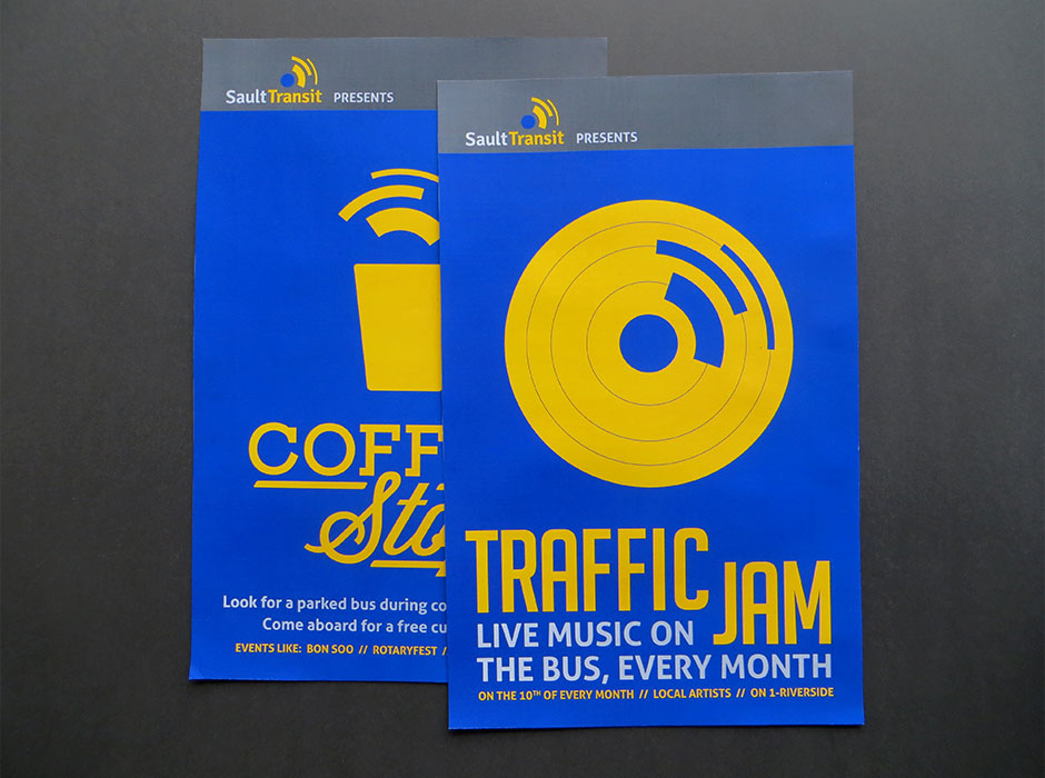
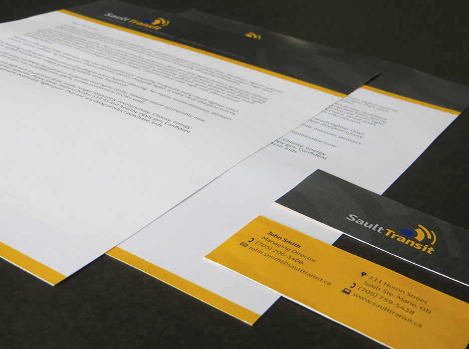
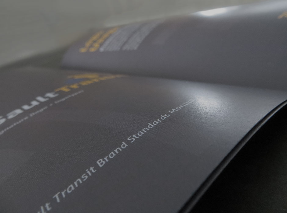
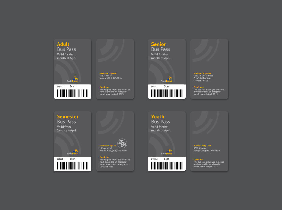
The following artifacts were redesigned to match the new brand qualities: Stationery, business cards, a brand standards manual, bus passes, a fare schedule, and a poster campaign. The main update from the old passes to the new ones is the barcode which can be conveniently scanned from a variety of media (physical or digital). The poster campaign was to portray Sault Transit as an active contributor to the community and to help people feel more included.
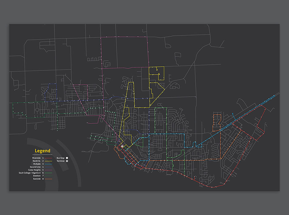
Two maps were designed, both for different applications. The full-sized map would be used in the bus terminal and for digital contexts where detail is expandable. The simplified map would be used in bus shelters and on busses. They provide the most important information in a convenient, orderly, and easy-to-understand way.

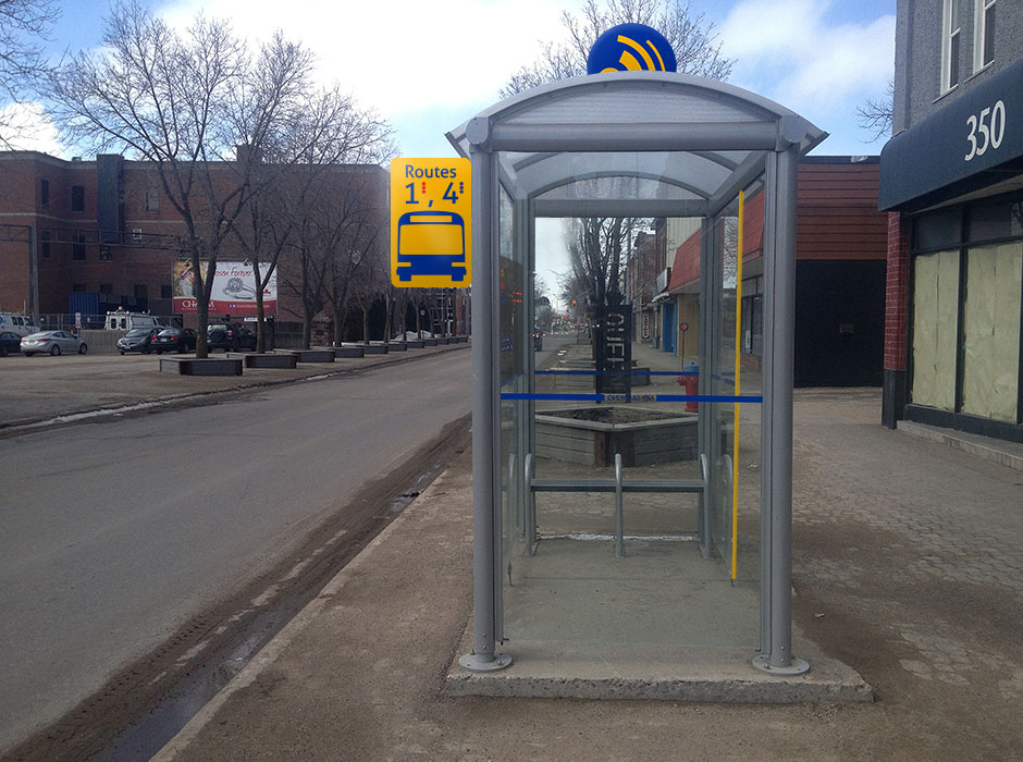
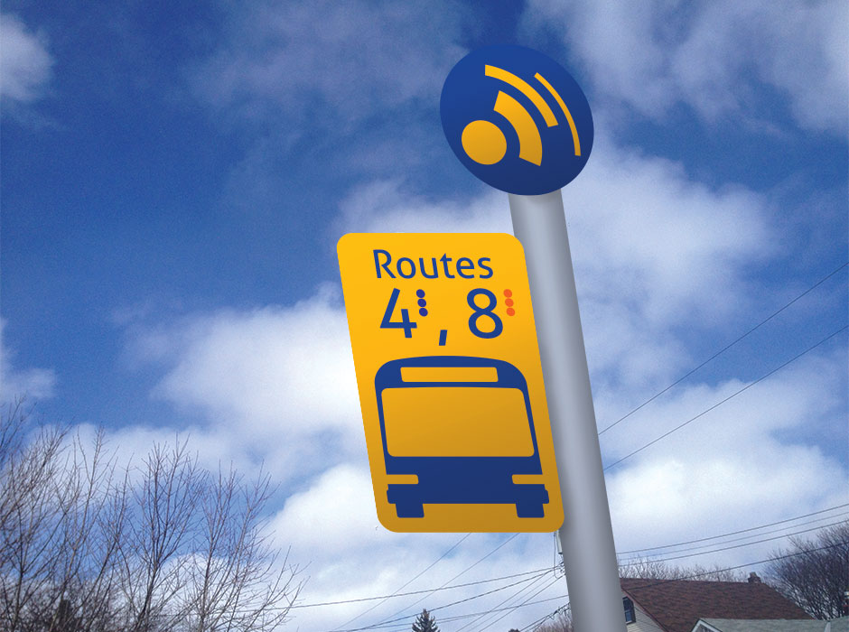
The majority of the brand uses a lot of grey to create order and draw attention to the information, but the stop, shelter, bus wrap, and campaign posters all take advantage of the brand’s bright blue and yellow colour-combination in order to grab attention and add personality.
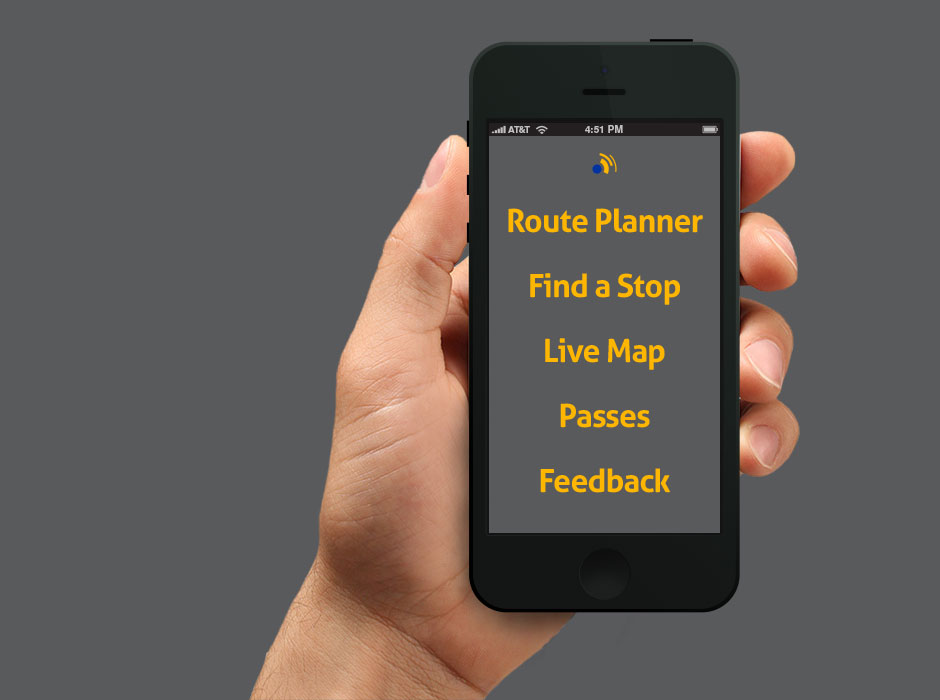
For the convenience of the bus riders, an app was designed with useful and relevant functionality. You can plan your route, find a stop, view a live map with bus locations, and buy, manage, and use your bus passes.
Eric’s rebrand product was vibrant and appealing to the management team at Sault Transit. His creative interpretation of what he thought Sault Transit should present to the public was visually stimulating and cost effective. Our management team will definitely refer to Eric’s work when we look to rebrand our current image for Sault Ste. Marie Transit Services.
Don Scott, Manager of Transit and Parking